%20--%3e%3cpolygon%20points='24.7%201%200%201%200%207.6%208.5%207.6%208.5%2039.4%2016.1%2039.4%2016.1%207.6%2024.7%207.6%2024.7%201'/%3e%3cpath%20d='M34.1,32.4l-4.9-22.7h-7.9l9.1,33.1c-.4,1.7-1.1,2.9-3.7,2.9h-2.6l1.9,6.6h1.5c4,0,8-1.2,10.3-9.2,1.8-6.4,8.9-33.3,8.9-33.3h-8l-4.6,22.7Z'/%3e%3cpath%20d='M91.7,8.7c-8.7,0-12.7,6.5-12.7,16.1s3.6,15.3,13.8,15.3,7.2-.9,9-1.6l-1.2-6c-2.4.8-4.9,1.2-7,1.2-4.3,0-7-2-7.2-7.3h16v-4.8c0-7.5-2.9-13-10.7-13ZM86.5,21c0-3.3,1.7-6.4,4.7-6.4s4.1,2.7,4.1,6.4h-8.8Z'/%3e%3cpath%20d='M218,8.7c-8.7,0-12.7,6.5-12.7,16.1s3.6,15.3,13.8,15.3,7.2-.9,9-1.6l-1.2-6c-2.5.8-4.9,1.2-7,1.2-4.3,0-7-2-7.2-7.3h16v-4.8c0-7.5-2.9-13-10.7-13ZM212.9,21c0-3.3,1.7-6.4,4.7-6.4s4.1,2.7,4.1,6.4h-8.8Z'/%3e%3cpath%20d='M126,1h-10.7v38.4h7.6v-11.8h5c6,0,11.3-3.8,11.3-14.1s-5.5-12.5-13.1-12.5ZM125.9,20.9h-3.1V7.6h3c3.7,0,5.4,1.8,5.4,6.3s-1.5,7.1-5.3,7.1Z'/%3e%3cpath%20d='M150,12.9c-.2-1-.5-2.4-.8-3.2h-6.9c.5,1.9.7,4.6.7,7.9v21.8h7.4v-20.3c1.1-2.2,4.5-3,7.4-3v-6.8c-3.5,0-6.5,1.7-7.7,3.6Z'/%3e%3cpath%20d='M192.6,40.6c0,3.5-1.6,4-4.7,4h-1.5l1.9,6.6h2.3c6.3,0,9.3-3.2,9.3-9.8V9.7h-7.4v30.9Z'/%3e%3crect%20x='192.2'%20width='8.4'%20height='6.4'/%3e%3cpath%20d='M247.4,33.7c-4.8,0-6.6-2.8-6.6-9.6s1.9-8.9,6.2-8.9,3.4.4,4.9,1l1-6.4c-1.3-.5-3.7-.9-6.2-.9-10.6,0-13.4,6.7-13.4,15.9h0c0,10.7,4.6,15.3,12.4,15.3s5.9-.5,7.4-1l-.9-6.1c-2,.4-3.7.6-4.7.6Z'/%3e%3cpath%20d='M264.7,30.2v-14.2h5.4l1.4-5.8h-6.9V2.1l-7.3,1.9v26.8c0,5.3,2.4,9,8.2,9s4.9-.2,4.9-.2v-5.7h-2c-3,0-3.8-1.3-3.8-3.7Z'/%3e%3cpath%20d='M64.3,8.8c-3.3,0-5.8,1.6-7.3,3.4-.2-1.1-.5-2.1-.8-2.6h-6.6c.5,1.9.6,4.4.6,7.4v34.4h7.3v-13.8c1.5,1.5,3.8,2.4,6.2,2.4,8,0,11.2-6.6,11.2-16s-3.1-15.2-10.4-15.2ZM62.1,33.8c-1.6,0-3.1-.6-4.6-1.8-.3-1.6-.4-3.7-.4-6v-3.3c0-1.8.1-3.8.4-5.1,1.4-1.4,3-2.5,5-2.5,3.2,0,4.6,3.2,4.6,9s-.9,9.6-5,9.6Z'/%3e%3cpath%20d='M173.6,8.6c-9.5,0-13,6.7-13,15.7s3.5,16.1,13,16.1,13-6.8,13-16.2-3.3-15.7-13-15.7ZM173.6,34.2c-3.6,0-5.5-2.9-5.5-9.9s2.2-9.5,5.5-9.5,5.5,2.2,5.5,9.5-1.9,9.9-5.5,9.9Z'/%3e%3c/svg%3e)

2026.2/16
Visual Adjustment and Typeface Design 01: “Line Thickness and Density”
In this series, I would like to introduce “visual adjustment,” helpful when designing typeface.
Previously in articles in the “Behind the Scenes in Typeface Creation” series, I mentioned several visual adjustments involved in typeface design. In this series, I would like to introduce them in a little more detail.
First of all, “visual adjustment” refers to the process of making minor adjustments in a design in consideration of visual illusions of the human eye called “optical illusions.” As the human eye can be easily deceived, numerically identical objects may look different in size, or well-formed shapes may look distorted.
By knowing the laws of said optical illusions and making adjustments accordingly, we can eliminate any sense of wrongness in design, and change it into a shape that is pleasing to the human eye.
Visual adjustments include line thickness and length, shape size, and various other types of adjustments. In this article, let us look at points related to “line thickness.”
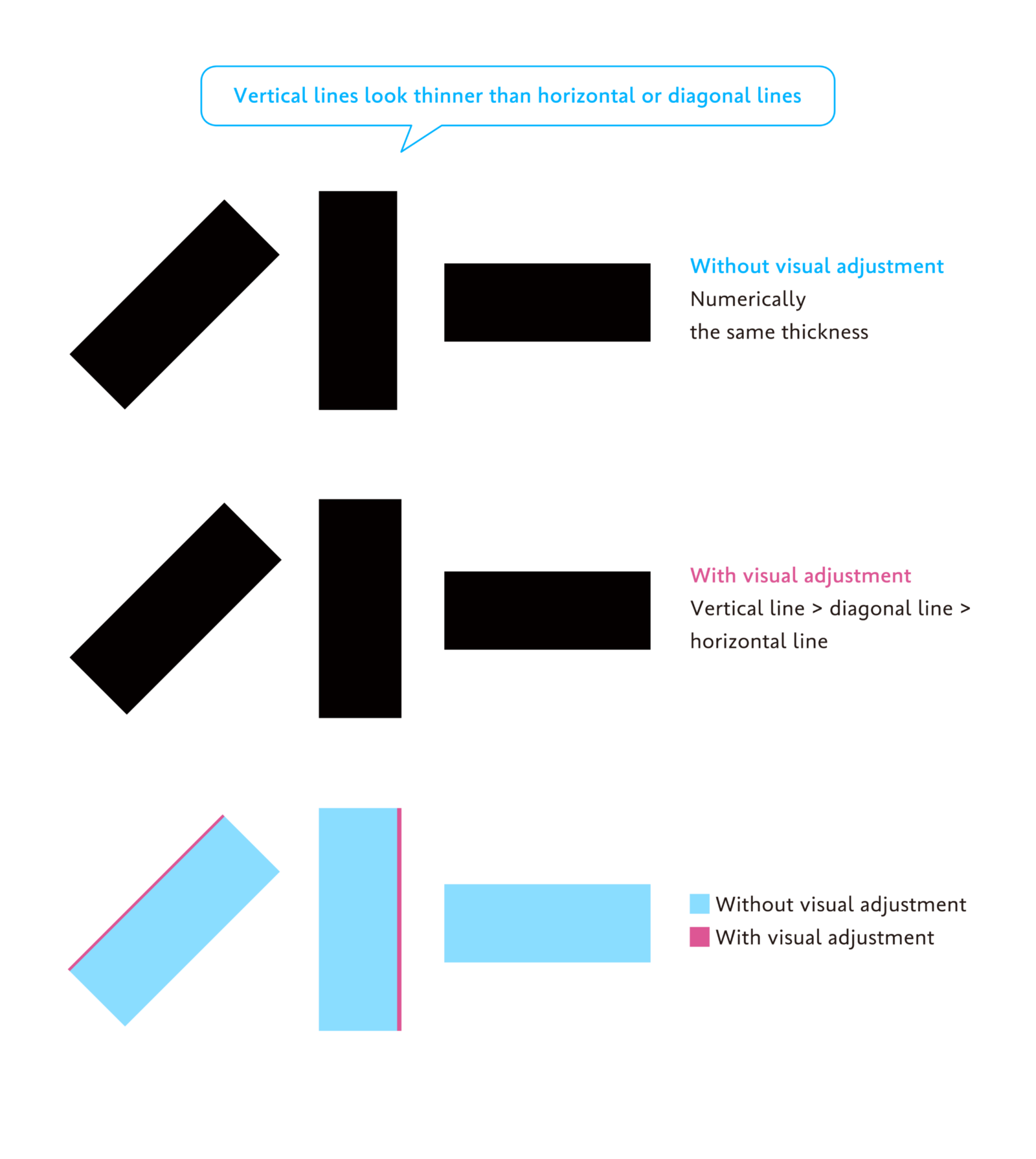
The first point is “making vertical lines thicker than horizontal lines.”
Even if the numerical thickness of a line is the same, it looks different to the human eye depending on the direction and shape of the line. Whether it is straight or curved, vertical lines tend to look thinner than horizontal lines. Therefore, to make them look like the same line width, it is recommended to make vertical lines slightly thicker than horizontal lines.
Diagonal lines tend to look thicker than vertical lines and thinner than horizontal lines. Therefore, after adjusting the thickness of the vertical and horizontal lines, adjust the diagonal line to a thickness in between the two to achieve balance.
Similarly, in character design, thickening a line in the vertical direction can create a stable appearance. As shown in the diagram below, the kanji character “下” and the letter “O” are designed with numerically thicker lines in the vertical direction.
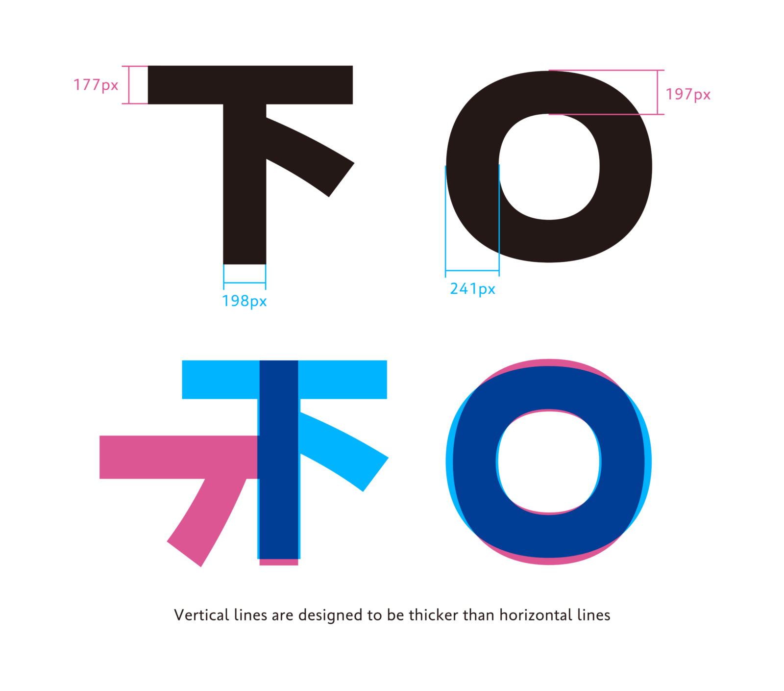
Vertical lines are designed to be thicker than horizontal lines
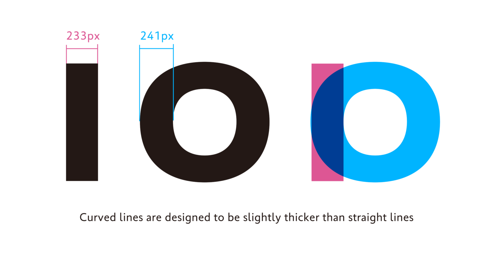
The second point is “making curved lines thicker than straight lines.” By making curved lines slightly thicker than straight lines, the overall tone is aligned. Looking at the Latin “I” and “O,” you can see that this adjustment has been made.
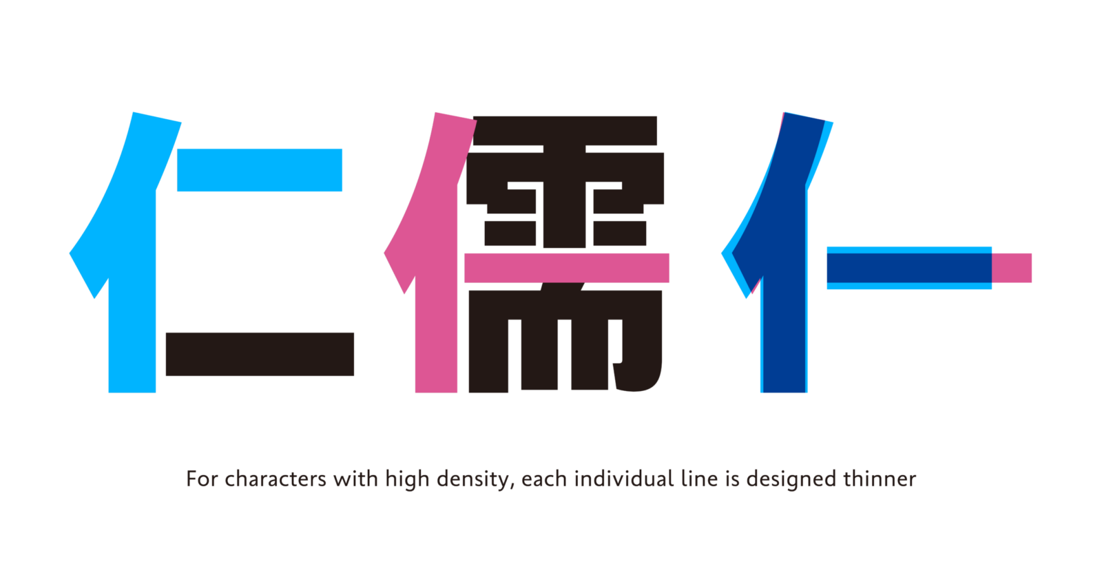
The third point is “changing line width depending on line density.”
In addition to fundamental line thickness adjustments, such as in the first and second points, in typeface design, it is important to align characters with different numbers of strokes into a single typeface with consistent tone (density). For characters with a large number of strokes and high density, the overall tone is adjusted by restraining the thickness of each individual stroke line.
As shown in the diagram below, thickness is adjusted depending on the total number of strokes, even for kanji with the same “ninben” radical.
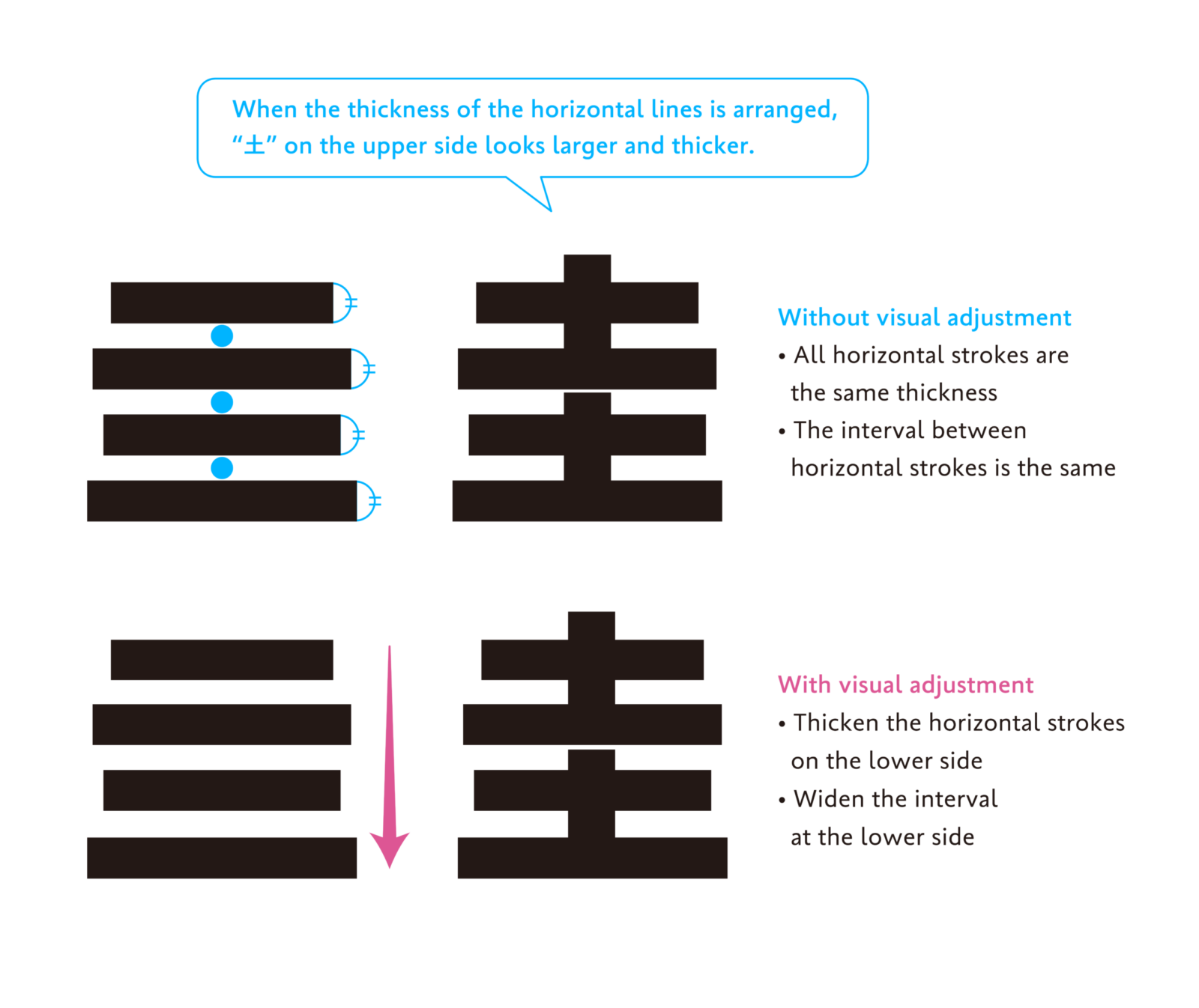
The fourth point is “making the lower side thicker” and “making the right side thicker.”
When there are multiple lines in the same direction within a single character, making all the lines the same thickness results in a character shape that lacks balance.
As mentioned in the article “Behind the Scenes in Typeface Creation: Visual Adjustment 02 ‘Line Thickness,’” the human eye perceives the upper part as more expanded than the lower part and the left side looks more expanded than the right. Therefore, the lines within characters are adjusted to be thicker on the lower and right sides.
In the example of “圭” below, in addition to the thickness of the lines, the space between the horizontal strokes has also been adjusted. Visual adjustment of the size of the space is scheduled to be introduced in more detail in a future article.
Even looking at line thickness alone, various detailed adjustments are made to achieve a design that is easy to read as character and as one cohesive typeface.
Visual adjustment doesn’t have a numerically correct answer – it is work that relies on the designer’s eye and sense. This knowledge, however, is useful not only for typeface design but also for different creative work, such as graphic design, illustration, etc. As fundamental points will also be introduced in the future articles, please feel free to use them as a reference, if you are interested.
(XYZ)