%20--%3e%3cpolygon%20points='24.7%201%200%201%200%207.6%208.5%207.6%208.5%2039.4%2016.1%2039.4%2016.1%207.6%2024.7%207.6%2024.7%201'/%3e%3cpath%20d='M34.1,32.4l-4.9-22.7h-7.9l9.1,33.1c-.4,1.7-1.1,2.9-3.7,2.9h-2.6l1.9,6.6h1.5c4,0,8-1.2,10.3-9.2,1.8-6.4,8.9-33.3,8.9-33.3h-8l-4.6,22.7Z'/%3e%3cpath%20d='M91.7,8.7c-8.7,0-12.7,6.5-12.7,16.1s3.6,15.3,13.8,15.3,7.2-.9,9-1.6l-1.2-6c-2.4.8-4.9,1.2-7,1.2-4.3,0-7-2-7.2-7.3h16v-4.8c0-7.5-2.9-13-10.7-13ZM86.5,21c0-3.3,1.7-6.4,4.7-6.4s4.1,2.7,4.1,6.4h-8.8Z'/%3e%3cpath%20d='M218,8.7c-8.7,0-12.7,6.5-12.7,16.1s3.6,15.3,13.8,15.3,7.2-.9,9-1.6l-1.2-6c-2.5.8-4.9,1.2-7,1.2-4.3,0-7-2-7.2-7.3h16v-4.8c0-7.5-2.9-13-10.7-13ZM212.9,21c0-3.3,1.7-6.4,4.7-6.4s4.1,2.7,4.1,6.4h-8.8Z'/%3e%3cpath%20d='M126,1h-10.7v38.4h7.6v-11.8h5c6,0,11.3-3.8,11.3-14.1s-5.5-12.5-13.1-12.5ZM125.9,20.9h-3.1V7.6h3c3.7,0,5.4,1.8,5.4,6.3s-1.5,7.1-5.3,7.1Z'/%3e%3cpath%20d='M150,12.9c-.2-1-.5-2.4-.8-3.2h-6.9c.5,1.9.7,4.6.7,7.9v21.8h7.4v-20.3c1.1-2.2,4.5-3,7.4-3v-6.8c-3.5,0-6.5,1.7-7.7,3.6Z'/%3e%3cpath%20d='M192.6,40.6c0,3.5-1.6,4-4.7,4h-1.5l1.9,6.6h2.3c6.3,0,9.3-3.2,9.3-9.8V9.7h-7.4v30.9Z'/%3e%3crect%20x='192.2'%20width='8.4'%20height='6.4'/%3e%3cpath%20d='M247.4,33.7c-4.8,0-6.6-2.8-6.6-9.6s1.9-8.9,6.2-8.9,3.4.4,4.9,1l1-6.4c-1.3-.5-3.7-.9-6.2-.9-10.6,0-13.4,6.7-13.4,15.9h0c0,10.7,4.6,15.3,12.4,15.3s5.9-.5,7.4-1l-.9-6.1c-2,.4-3.7.6-4.7.6Z'/%3e%3cpath%20d='M264.7,30.2v-14.2h5.4l1.4-5.8h-6.9V2.1l-7.3,1.9v26.8c0,5.3,2.4,9,8.2,9s4.9-.2,4.9-.2v-5.7h-2c-3,0-3.8-1.3-3.8-3.7Z'/%3e%3cpath%20d='M64.3,8.8c-3.3,0-5.8,1.6-7.3,3.4-.2-1.1-.5-2.1-.8-2.6h-6.6c.5,1.9.6,4.4.6,7.4v34.4h7.3v-13.8c1.5,1.5,3.8,2.4,6.2,2.4,8,0,11.2-6.6,11.2-16s-3.1-15.2-10.4-15.2ZM62.1,33.8c-1.6,0-3.1-.6-4.6-1.8-.3-1.6-.4-3.7-.4-6v-3.3c0-1.8.1-3.8.4-5.1,1.4-1.4,3-2.5,5-2.5,3.2,0,4.6,3.2,4.6,9s-.9,9.6-5,9.6Z'/%3e%3cpath%20d='M173.6,8.6c-9.5,0-13,6.7-13,15.7s3.5,16.1,13,16.1,13-6.8,13-16.2-3.3-15.7-13-15.7ZM173.6,34.2c-3.6,0-5.5-2.9-5.5-9.9s2.2-9.5,5.5-9.5,5.5,2.2,5.5,9.5-1.9,9.9-5.5,9.9Z'/%3e%3c/svg%3e)

2026.3/23
TP Apricot Development Story 01: Unusual Latin Glyphs
TP Apricot’s Latin incorporates some unusual glyphs and functions to better utilize design features.
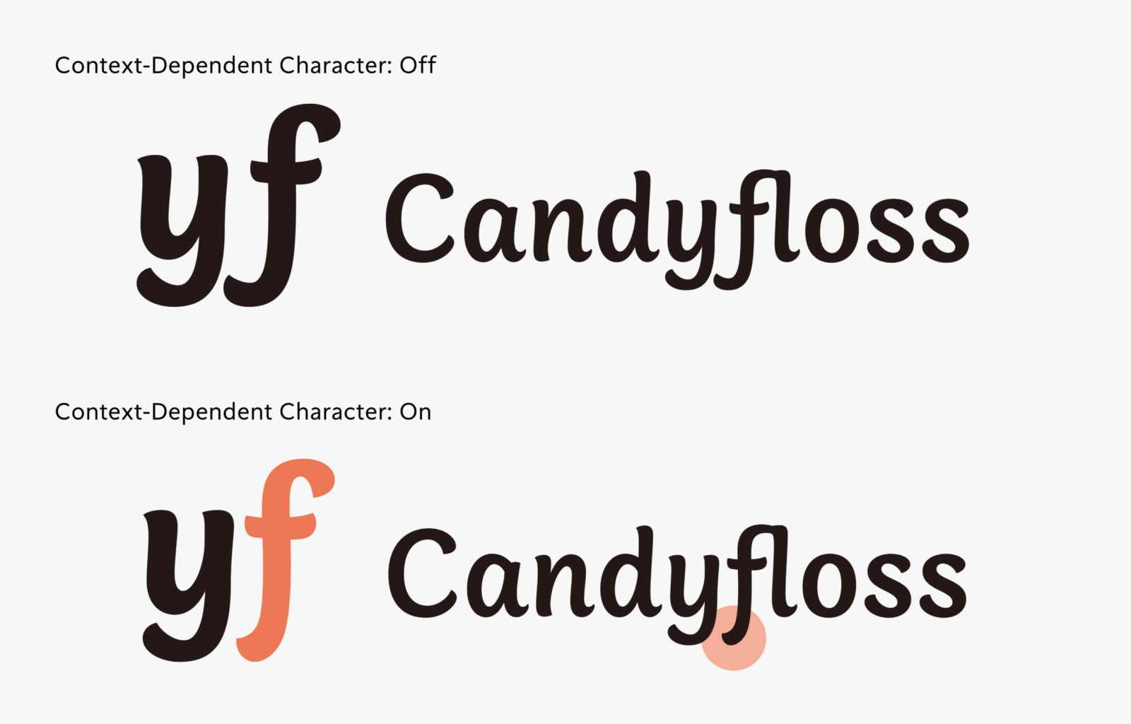
The first is an alternate glyph, known as a “Contextual Alternates.”
This is one of the OpenType features that prepares multiple character shapes as alternates; depending on the combination of preceding and following characters, the character shapes used are automatically switched. This is often used in cursive script, etc. to make the connections between characters appear natural.
TP Apricot utilizes this function to maintain clean spacing between characters while making use of unconstrained handwriting style character shapes.
For example, the descender of the lowercase letter “f” has a shape that protrudes significantly to the left. This character shape creates a unique rhythm and expression when arranged next to characters that do not have descenders, such as “o.” On the other hand, when arranged next to characters with descenders, such as “y,” the descenders will collide with each other.
Therefore, we prepared an alternate glyph for “f” with a shorter descender as a separate design, and set it up so that “when ‘f’ appears next to the right of ‘y,’ it switches to the ‘f’ with the shorter descender.” This enables reasonable typesetting while maintaining distinctive character shapes.
Shortening all the descenders of “f” was also an option, but the expression created by the long descenders is an essential element shaping the image of this typeface. For this reason, we adopted the “Contextual Alternates” function, which allows different character shapes to be selected depending on the situation.
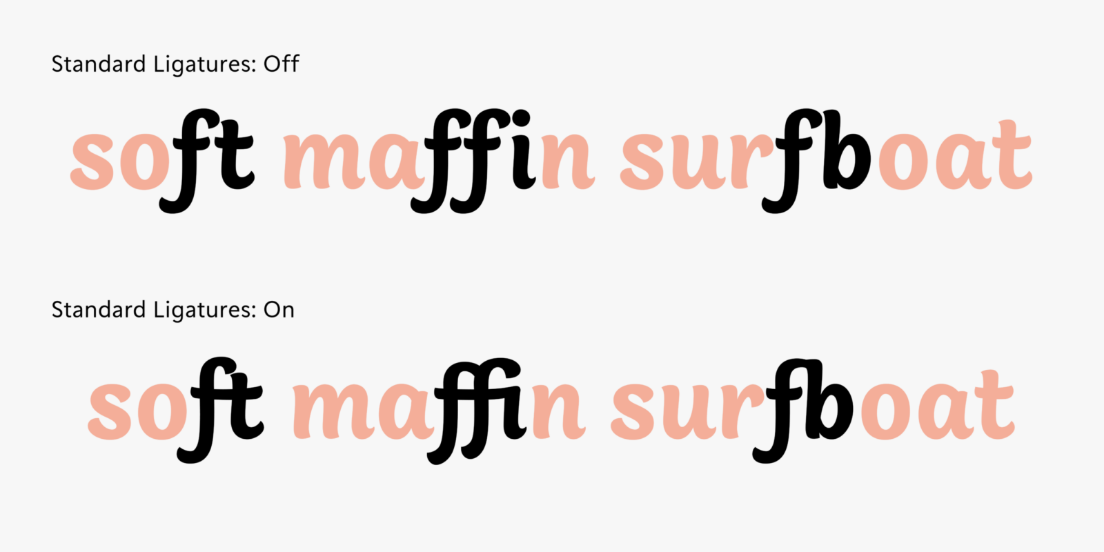
Another feature is “ligature.”
TP Apricot includes not only basic ligatures such as “fl” and “fi,” but also ligatures such as “ft,” “fb,” and “ffi” that are not included in the normal StdN version.
Similar to “Contextual Alternates,” these also represent a technique to achieve both individuality in characters and the beauty of spacing.
The glyphs and functions introduced here can be tried out from the OpenType features settings in Adobe Illustrator or Adobe InDesign. If you’re interested, please try switching it on and off to enjoy the changes in the character expressions.
Apart from the behind-the-scenes story here, the development story page provides detailed information about the design process and concept behind TP Apricot. Please take a look.
(XYZ)