%20--%3e%3cpolygon%20points='24.7%201%200%201%200%207.6%208.5%207.6%208.5%2039.4%2016.1%2039.4%2016.1%207.6%2024.7%207.6%2024.7%201'/%3e%3cpath%20d='M34.1,32.4l-4.9-22.7h-7.9l9.1,33.1c-.4,1.7-1.1,2.9-3.7,2.9h-2.6l1.9,6.6h1.5c4,0,8-1.2,10.3-9.2,1.8-6.4,8.9-33.3,8.9-33.3h-8l-4.6,22.7Z'/%3e%3cpath%20d='M91.7,8.7c-8.7,0-12.7,6.5-12.7,16.1s3.6,15.3,13.8,15.3,7.2-.9,9-1.6l-1.2-6c-2.4.8-4.9,1.2-7,1.2-4.3,0-7-2-7.2-7.3h16v-4.8c0-7.5-2.9-13-10.7-13ZM86.5,21c0-3.3,1.7-6.4,4.7-6.4s4.1,2.7,4.1,6.4h-8.8Z'/%3e%3cpath%20d='M218,8.7c-8.7,0-12.7,6.5-12.7,16.1s3.6,15.3,13.8,15.3,7.2-.9,9-1.6l-1.2-6c-2.5.8-4.9,1.2-7,1.2-4.3,0-7-2-7.2-7.3h16v-4.8c0-7.5-2.9-13-10.7-13ZM212.9,21c0-3.3,1.7-6.4,4.7-6.4s4.1,2.7,4.1,6.4h-8.8Z'/%3e%3cpath%20d='M126,1h-10.7v38.4h7.6v-11.8h5c6,0,11.3-3.8,11.3-14.1s-5.5-12.5-13.1-12.5ZM125.9,20.9h-3.1V7.6h3c3.7,0,5.4,1.8,5.4,6.3s-1.5,7.1-5.3,7.1Z'/%3e%3cpath%20d='M150,12.9c-.2-1-.5-2.4-.8-3.2h-6.9c.5,1.9.7,4.6.7,7.9v21.8h7.4v-20.3c1.1-2.2,4.5-3,7.4-3v-6.8c-3.5,0-6.5,1.7-7.7,3.6Z'/%3e%3cpath%20d='M192.6,40.6c0,3.5-1.6,4-4.7,4h-1.5l1.9,6.6h2.3c6.3,0,9.3-3.2,9.3-9.8V9.7h-7.4v30.9Z'/%3e%3crect%20x='192.2'%20width='8.4'%20height='6.4'/%3e%3cpath%20d='M247.4,33.7c-4.8,0-6.6-2.8-6.6-9.6s1.9-8.9,6.2-8.9,3.4.4,4.9,1l1-6.4c-1.3-.5-3.7-.9-6.2-.9-10.6,0-13.4,6.7-13.4,15.9h0c0,10.7,4.6,15.3,12.4,15.3s5.9-.5,7.4-1l-.9-6.1c-2,.4-3.7.6-4.7.6Z'/%3e%3cpath%20d='M264.7,30.2v-14.2h5.4l1.4-5.8h-6.9V2.1l-7.3,1.9v26.8c0,5.3,2.4,9,8.2,9s4.9-.2,4.9-.2v-5.7h-2c-3,0-3.8-1.3-3.8-3.7Z'/%3e%3cpath%20d='M64.3,8.8c-3.3,0-5.8,1.6-7.3,3.4-.2-1.1-.5-2.1-.8-2.6h-6.6c.5,1.9.6,4.4.6,7.4v34.4h7.3v-13.8c1.5,1.5,3.8,2.4,6.2,2.4,8,0,11.2-6.6,11.2-16s-3.1-15.2-10.4-15.2ZM62.1,33.8c-1.6,0-3.1-.6-4.6-1.8-.3-1.6-.4-3.7-.4-6v-3.3c0-1.8.1-3.8.4-5.1,1.4-1.4,3-2.5,5-2.5,3.2,0,4.6,3.2,4.6,9s-.9,9.6-5,9.6Z'/%3e%3cpath%20d='M173.6,8.6c-9.5,0-13,6.7-13,15.7s3.5,16.1,13,16.1,13-6.8,13-16.2-3.3-15.7-13-15.7ZM173.6,34.2c-3.6,0-5.5-2.9-5.5-9.9s2.2-9.5,5.5-9.5,5.5,2.2,5.5,9.5-1.9,9.9-5.5,9.9Z'/%3e%3c/svg%3e)

2026.8/31
TP Apricot Development Story 08: Design of Katakana
In the previous article, We provided a behind-the-scenes story about the design of hiragana. This time, I’d like to talk a little about the design of katakana from the perspective of the designer in charge. As mentioned previously, we divided the work of designing hiragana and katakana in TP Apricot.
I took the lead in designing the Latin and kanji first. Once the prototype for hiragana had progressed sufficiently to match them, I started designing the katakana. During the design, the designer in charge of hiragana shared materials and current issues with me.
At this point, Latin featured a inclined design, kanji was upright, and hiragana somewhat leaned toward kanji with a plump, composed design. Therefore, for katakana, I created two prototype designs: one leaning toward upright to match kanji and hiragana, and another incorporating the inclination of Latin for a slightly more dynamic feel.
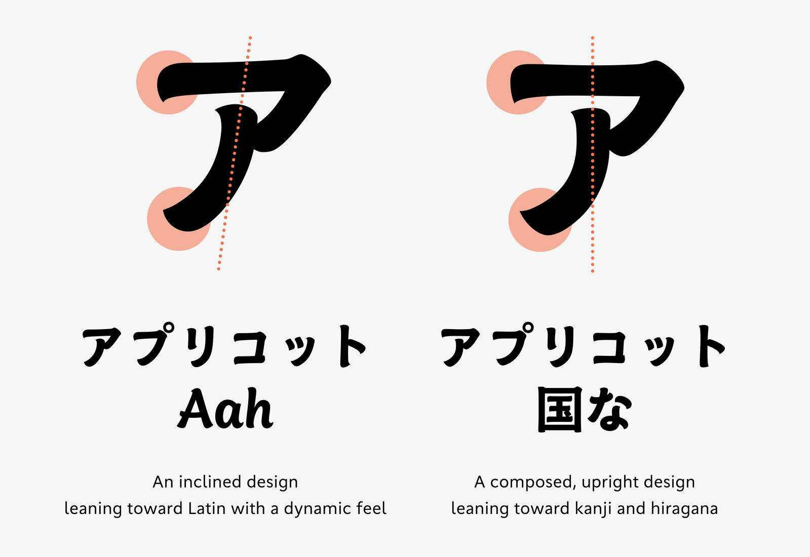
To determine which direction was more appropriate, I created a mixed typesetting sample of all character types and held repeated discussions with other members. I also conducted prototype testing for inclination variations for Latin. As a result, we came to the conclusion that restraining the inclination would provide a better balance between stability and ease of reading as a Japanese typeface, as well as fit the image of TP Apricot. Therefore, we decided to adopt a upright design for both Latin and katakana.
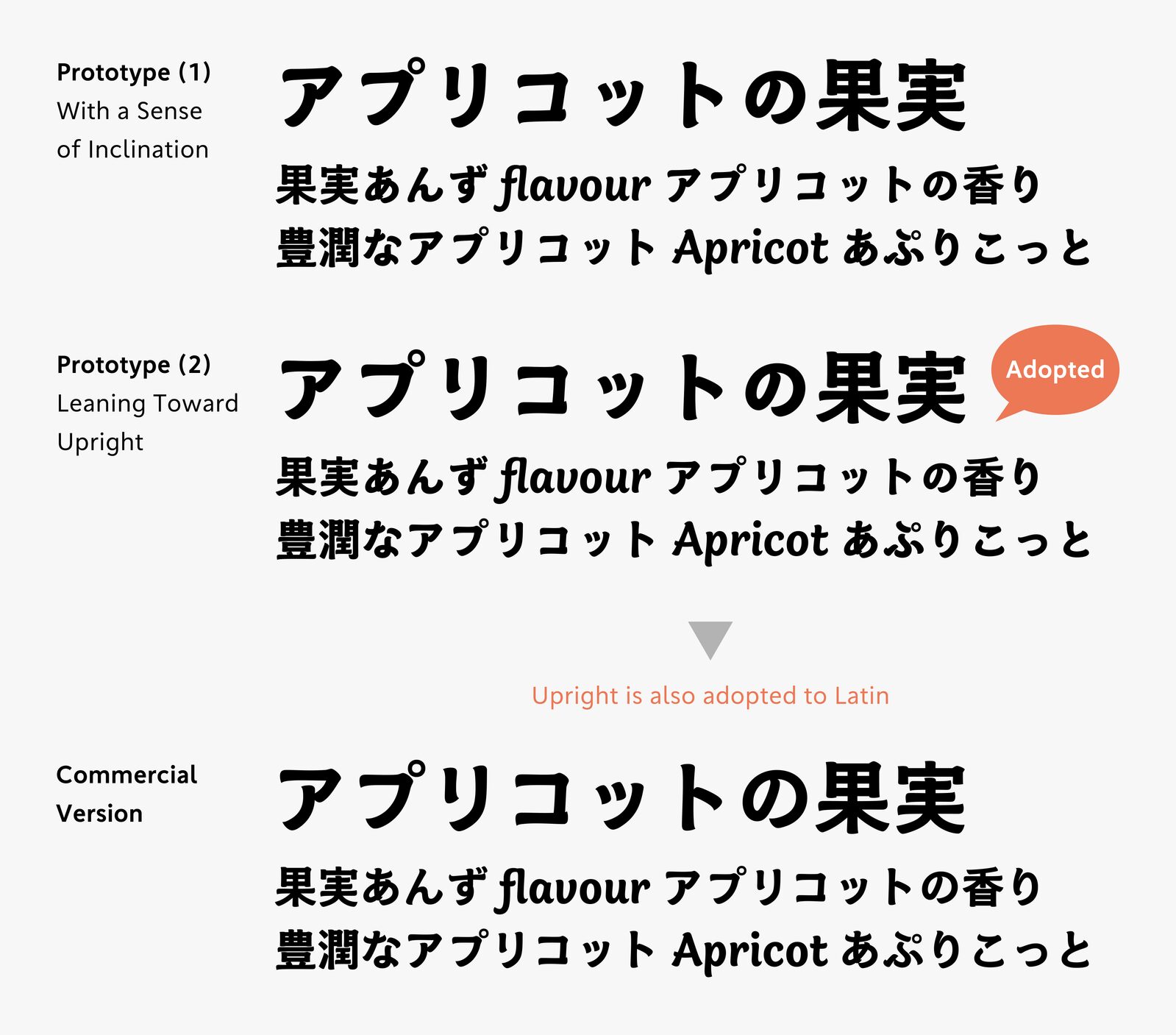
The process of exploring katakana designs that harmonize well with Latin and kanji possessing unique characteristics, unbound by specific calligraphic styles, was both fascinating and often perplexing, as I frequently found myself unsure which direction was most appropriate.
In such situations, by exchanging feedback and consulting with the designer in charge of hiragana about each other’s designs, we were able to gain new ideas from fresh perspectives. In the early stages of development, I spent long hours alone working on prototypes for Latin and kanji, so the process of designing hiragana and katakana simultaneously, exchanging ideas as we went, felt like a breath of fresh air.
Subsequent work to expand kanji and symbols was also carried out in close collaboration with the designer in charge of hiragana, and we successfully reached completion. We would be delighted if our accumulated trial and error were reflected in the typeface in a positive way.
Apart from the behind-the-scenes story introduced here, the development story page provides detailed information about the design process and concept behind TP Apricot. Please take a look.
(XYZ)