%20--%3e%3cpolygon%20points='24.7%201%200%201%200%207.6%208.5%207.6%208.5%2039.4%2016.1%2039.4%2016.1%207.6%2024.7%207.6%2024.7%201'/%3e%3cpath%20d='M34.1,32.4l-4.9-22.7h-7.9l9.1,33.1c-.4,1.7-1.1,2.9-3.7,2.9h-2.6l1.9,6.6h1.5c4,0,8-1.2,10.3-9.2,1.8-6.4,8.9-33.3,8.9-33.3h-8l-4.6,22.7Z'/%3e%3cpath%20d='M91.7,8.7c-8.7,0-12.7,6.5-12.7,16.1s3.6,15.3,13.8,15.3,7.2-.9,9-1.6l-1.2-6c-2.4.8-4.9,1.2-7,1.2-4.3,0-7-2-7.2-7.3h16v-4.8c0-7.5-2.9-13-10.7-13ZM86.5,21c0-3.3,1.7-6.4,4.7-6.4s4.1,2.7,4.1,6.4h-8.8Z'/%3e%3cpath%20d='M218,8.7c-8.7,0-12.7,6.5-12.7,16.1s3.6,15.3,13.8,15.3,7.2-.9,9-1.6l-1.2-6c-2.5.8-4.9,1.2-7,1.2-4.3,0-7-2-7.2-7.3h16v-4.8c0-7.5-2.9-13-10.7-13ZM212.9,21c0-3.3,1.7-6.4,4.7-6.4s4.1,2.7,4.1,6.4h-8.8Z'/%3e%3cpath%20d='M126,1h-10.7v38.4h7.6v-11.8h5c6,0,11.3-3.8,11.3-14.1s-5.5-12.5-13.1-12.5ZM125.9,20.9h-3.1V7.6h3c3.7,0,5.4,1.8,5.4,6.3s-1.5,7.1-5.3,7.1Z'/%3e%3cpath%20d='M150,12.9c-.2-1-.5-2.4-.8-3.2h-6.9c.5,1.9.7,4.6.7,7.9v21.8h7.4v-20.3c1.1-2.2,4.5-3,7.4-3v-6.8c-3.5,0-6.5,1.7-7.7,3.6Z'/%3e%3cpath%20d='M192.6,40.6c0,3.5-1.6,4-4.7,4h-1.5l1.9,6.6h2.3c6.3,0,9.3-3.2,9.3-9.8V9.7h-7.4v30.9Z'/%3e%3crect%20x='192.2'%20width='8.4'%20height='6.4'/%3e%3cpath%20d='M247.4,33.7c-4.8,0-6.6-2.8-6.6-9.6s1.9-8.9,6.2-8.9,3.4.4,4.9,1l1-6.4c-1.3-.5-3.7-.9-6.2-.9-10.6,0-13.4,6.7-13.4,15.9h0c0,10.7,4.6,15.3,12.4,15.3s5.9-.5,7.4-1l-.9-6.1c-2,.4-3.7.6-4.7.6Z'/%3e%3cpath%20d='M264.7,30.2v-14.2h5.4l1.4-5.8h-6.9V2.1l-7.3,1.9v26.8c0,5.3,2.4,9,8.2,9s4.9-.2,4.9-.2v-5.7h-2c-3,0-3.8-1.3-3.8-3.7Z'/%3e%3cpath%20d='M64.3,8.8c-3.3,0-5.8,1.6-7.3,3.4-.2-1.1-.5-2.1-.8-2.6h-6.6c.5,1.9.6,4.4.6,7.4v34.4h7.3v-13.8c1.5,1.5,3.8,2.4,6.2,2.4,8,0,11.2-6.6,11.2-16s-3.1-15.2-10.4-15.2ZM62.1,33.8c-1.6,0-3.1-.6-4.6-1.8-.3-1.6-.4-3.7-.4-6v-3.3c0-1.8.1-3.8.4-5.1,1.4-1.4,3-2.5,5-2.5,3.2,0,4.6,3.2,4.6,9s-.9,9.6-5,9.6Z'/%3e%3cpath%20d='M173.6,8.6c-9.5,0-13,6.7-13,15.7s3.5,16.1,13,16.1,13-6.8,13-16.2-3.3-15.7-13-15.7ZM173.6,34.2c-3.6,0-5.5-2.9-5.5-9.9s2.2-9.5,5.5-9.5,5.5,2.2,5.5,9.5-1.9,9.9-5.5,9.9Z'/%3e%3c/svg%3e)

2025.12/22
Introduction to Example of TP Font Usage: “TP Mincho Part 1”
Type Project font will be introduced based on examples of usage in each medium, including packages, books, websites, and advertisements. Today, I would like to introduce product packages and exhibition visuals in which TP Mincho is used. *Including some adjusted characters.
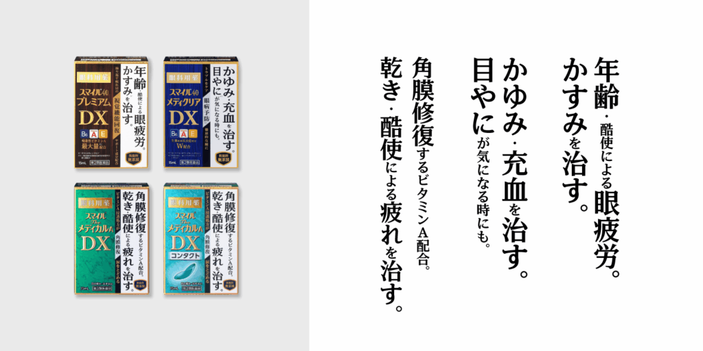
Product Packaging: LION “Smile DX Series”
Manufacturer: Lion Corporation
URL: https://smile.lion.co.jp/products/smile40_mediclear_dx.htm
[Type Project Font Used]
TP Mincho Low Contrast
TP Mincho Low Contrast is used for the catch phrase in the product package for the eye drops “Smile DX Series” sold by Lion Corporation. As the efficacy of each product is indicated in black ink on a white background on the right side of the package in varying sizes, the message is conveyed clearly with high visibility. There are three types of TP Mincho: Low Contrast, Medium Contrast, and High Contrast. In the Smile DX Series, the toughest and boldest Low Contrast is adopted.
Even in drugstores, etc. filled with numerous products, TP Mincho Low Contrast combines a boldness reminiscent of Gothic typeface with an elegance specific to Mincho typeface, and it can be said that this design element gives a strong appeal.
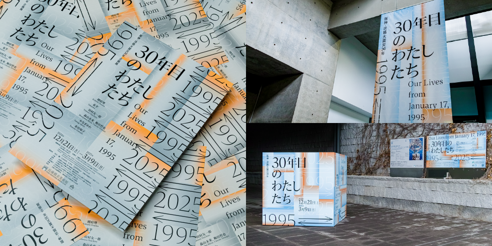
Promotional Graphics for the Exhibition: “1995 ⇄ 2025 Our Lives from January 17, 1995”
Organizer: Hyogo Prefectural Museum of Art, The Kobe Shimbun, and The Asahi Shimbun
URL: https://www.artm.pref.hyogo.jp/exhibition/t_2412/
[Type Project Font Used]
TP Mincho, TP Gothic
In a special exhibition marking the 30th year since the Great Hanshin-Awaji Earthquake, “1995 ⇄ 2025 Our Lives from January 17, 1995,” held at the Hyogo Prefectural Museum of Art from December 2024 to March 2025, TP Mincho is used in advertising materials such as flyers, posters, venue tapestries, and panels, extending even to the exhibition catalog, with TP Gothic also appearing in some parts. In addition to the gradation of orange and pale blue, the recurring “1995 ⇄ 2025,” visually conveys the passage of time moving from the past to the present and into the future. The design of numbers, such as “1995,” “2025,” and “30” in particular leave a strong impression.
TP Mincho High Contrast is used in large sizes in the title part. It appears that TP Mincho Medium Contrast, which has stable ease of reading even in small sizes, is used in the information part, such as names of participating artists and dates. By using High Contrast, which gives a sharp and rigid impression, a consistent impression is maintained from flyers to venue visuals and catalogs – this may have contributed to improving the overall visual identity of the exhibition.
(KT)