%20--%3e%3cpolygon%20points='24.7%201%200%201%200%207.6%208.5%207.6%208.5%2039.4%2016.1%2039.4%2016.1%207.6%2024.7%207.6%2024.7%201'/%3e%3cpath%20d='M34.1,32.4l-4.9-22.7h-7.9l9.1,33.1c-.4,1.7-1.1,2.9-3.7,2.9h-2.6l1.9,6.6h1.5c4,0,8-1.2,10.3-9.2,1.8-6.4,8.9-33.3,8.9-33.3h-8l-4.6,22.7Z'/%3e%3cpath%20d='M91.7,8.7c-8.7,0-12.7,6.5-12.7,16.1s3.6,15.3,13.8,15.3,7.2-.9,9-1.6l-1.2-6c-2.4.8-4.9,1.2-7,1.2-4.3,0-7-2-7.2-7.3h16v-4.8c0-7.5-2.9-13-10.7-13ZM86.5,21c0-3.3,1.7-6.4,4.7-6.4s4.1,2.7,4.1,6.4h-8.8Z'/%3e%3cpath%20d='M218,8.7c-8.7,0-12.7,6.5-12.7,16.1s3.6,15.3,13.8,15.3,7.2-.9,9-1.6l-1.2-6c-2.5.8-4.9,1.2-7,1.2-4.3,0-7-2-7.2-7.3h16v-4.8c0-7.5-2.9-13-10.7-13ZM212.9,21c0-3.3,1.7-6.4,4.7-6.4s4.1,2.7,4.1,6.4h-8.8Z'/%3e%3cpath%20d='M126,1h-10.7v38.4h7.6v-11.8h5c6,0,11.3-3.8,11.3-14.1s-5.5-12.5-13.1-12.5ZM125.9,20.9h-3.1V7.6h3c3.7,0,5.4,1.8,5.4,6.3s-1.5,7.1-5.3,7.1Z'/%3e%3cpath%20d='M150,12.9c-.2-1-.5-2.4-.8-3.2h-6.9c.5,1.9.7,4.6.7,7.9v21.8h7.4v-20.3c1.1-2.2,4.5-3,7.4-3v-6.8c-3.5,0-6.5,1.7-7.7,3.6Z'/%3e%3cpath%20d='M192.6,40.6c0,3.5-1.6,4-4.7,4h-1.5l1.9,6.6h2.3c6.3,0,9.3-3.2,9.3-9.8V9.7h-7.4v30.9Z'/%3e%3crect%20x='192.2'%20width='8.4'%20height='6.4'/%3e%3cpath%20d='M247.4,33.7c-4.8,0-6.6-2.8-6.6-9.6s1.9-8.9,6.2-8.9,3.4.4,4.9,1l1-6.4c-1.3-.5-3.7-.9-6.2-.9-10.6,0-13.4,6.7-13.4,15.9h0c0,10.7,4.6,15.3,12.4,15.3s5.9-.5,7.4-1l-.9-6.1c-2,.4-3.7.6-4.7.6Z'/%3e%3cpath%20d='M264.7,30.2v-14.2h5.4l1.4-5.8h-6.9V2.1l-7.3,1.9v26.8c0,5.3,2.4,9,8.2,9s4.9-.2,4.9-.2v-5.7h-2c-3,0-3.8-1.3-3.8-3.7Z'/%3e%3cpath%20d='M64.3,8.8c-3.3,0-5.8,1.6-7.3,3.4-.2-1.1-.5-2.1-.8-2.6h-6.6c.5,1.9.6,4.4.6,7.4v34.4h7.3v-13.8c1.5,1.5,3.8,2.4,6.2,2.4,8,0,11.2-6.6,11.2-16s-3.1-15.2-10.4-15.2ZM62.1,33.8c-1.6,0-3.1-.6-4.6-1.8-.3-1.6-.4-3.7-.4-6v-3.3c0-1.8.1-3.8.4-5.1,1.4-1.4,3-2.5,5-2.5,3.2,0,4.6,3.2,4.6,9s-.9,9.6-5,9.6Z'/%3e%3cpath%20d='M173.6,8.6c-9.5,0-13,6.7-13,15.7s3.5,16.1,13,16.1,13-6.8,13-16.2-3.3-15.7-13-15.7ZM173.6,34.2c-3.6,0-5.5-2.9-5.5-9.9s2.2-9.5,5.5-9.5,5.5,2.2,5.5,9.5-1.9,9.9-5.5,9.9Z'/%3e%3c/svg%3e)

2026.1/26
Introduction to Example of TP Font Usage: “Book Titles Part 5”
Type Project font will be introduced based on examples of usage in each medium, including packages, books, websites, and advertisements.
Today, I would like to introduce books in which TP Gothic is used.
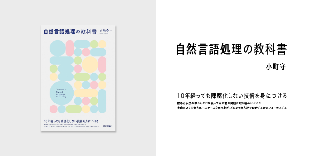
“Textbook of Natural Language Processing”
Author: Mamoru Komachi
Publisher: Gijutsu-Hyohron Co., Ltd.
Book Information: https://gihyo.jp/book/2024/978-4-297-13863-9
[Type Project Font Used]
TP Gothic Condensed
This book compiles fundamental knowledge on natural language processing; TP Gothic Condensed is used in the title, for the name of the author, and catch phrase. The design features striking geometric shapes in pale blue, red, green, and yellow. Combined with a light gray background, the overall pastel tone creates a light and gentle impression, conveying an “approachable feel.” By using Condensed instead of Regular and slightly widening the space between characters, an impression that feels weightless is emphasized. Furthermore, the weights in “Textbook of” and “Natural Language Processing” of the title are varied to create emphasis, naturally guiding the gaze. Despite its simple structure, the rich expression of TP Gothic, including serif in the beginning of each brushstroke and modulation in strokes specific to Gothic typeface, and the gouge of sweep adds an accent to the entire cover.
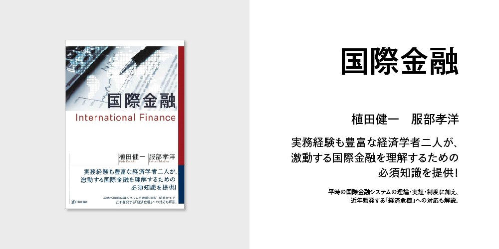
“International Finance”
Author: Kenichi Ueda, Takahiro Hattori
Publisher: Nippon Hyoron Sha Co., Ltd.
Book Information: https://www.nippyo.co.jp/shop/book/9400.html
[Type Project Font Used]
TP Gothic
Written by two experts with extensive practical experience, this book explains essential knowledge for understanding international finance; TP Gothic is used in the title, for the names of the authors, and catch phrase. The structure provides overall coherence with the use of red as an accent color to the white-based background. The title “International Finance” is arranged relatively large at the top of the book, creating a clear contrast with the names of the authors and the phrase on the book band due to the difference in size. The font weight is kept to a minimum to avoid excessive ornamentation, resulting in emphasizing solidity. The orthodox and stable impression of TP Gothic harmonizes well with the reliability and calm atmosphere expected of a specialized book.
(KT)