%20--%3e%3cpolygon%20points='24.7%201%200%201%200%207.6%208.5%207.6%208.5%2039.4%2016.1%2039.4%2016.1%207.6%2024.7%207.6%2024.7%201'/%3e%3cpath%20d='M34.1,32.4l-4.9-22.7h-7.9l9.1,33.1c-.4,1.7-1.1,2.9-3.7,2.9h-2.6l1.9,6.6h1.5c4,0,8-1.2,10.3-9.2,1.8-6.4,8.9-33.3,8.9-33.3h-8l-4.6,22.7Z'/%3e%3cpath%20d='M91.7,8.7c-8.7,0-12.7,6.5-12.7,16.1s3.6,15.3,13.8,15.3,7.2-.9,9-1.6l-1.2-6c-2.4.8-4.9,1.2-7,1.2-4.3,0-7-2-7.2-7.3h16v-4.8c0-7.5-2.9-13-10.7-13ZM86.5,21c0-3.3,1.7-6.4,4.7-6.4s4.1,2.7,4.1,6.4h-8.8Z'/%3e%3cpath%20d='M218,8.7c-8.7,0-12.7,6.5-12.7,16.1s3.6,15.3,13.8,15.3,7.2-.9,9-1.6l-1.2-6c-2.5.8-4.9,1.2-7,1.2-4.3,0-7-2-7.2-7.3h16v-4.8c0-7.5-2.9-13-10.7-13ZM212.9,21c0-3.3,1.7-6.4,4.7-6.4s4.1,2.7,4.1,6.4h-8.8Z'/%3e%3cpath%20d='M126,1h-10.7v38.4h7.6v-11.8h5c6,0,11.3-3.8,11.3-14.1s-5.5-12.5-13.1-12.5ZM125.9,20.9h-3.1V7.6h3c3.7,0,5.4,1.8,5.4,6.3s-1.5,7.1-5.3,7.1Z'/%3e%3cpath%20d='M150,12.9c-.2-1-.5-2.4-.8-3.2h-6.9c.5,1.9.7,4.6.7,7.9v21.8h7.4v-20.3c1.1-2.2,4.5-3,7.4-3v-6.8c-3.5,0-6.5,1.7-7.7,3.6Z'/%3e%3cpath%20d='M192.6,40.6c0,3.5-1.6,4-4.7,4h-1.5l1.9,6.6h2.3c6.3,0,9.3-3.2,9.3-9.8V9.7h-7.4v30.9Z'/%3e%3crect%20x='192.2'%20width='8.4'%20height='6.4'/%3e%3cpath%20d='M247.4,33.7c-4.8,0-6.6-2.8-6.6-9.6s1.9-8.9,6.2-8.9,3.4.4,4.9,1l1-6.4c-1.3-.5-3.7-.9-6.2-.9-10.6,0-13.4,6.7-13.4,15.9h0c0,10.7,4.6,15.3,12.4,15.3s5.9-.5,7.4-1l-.9-6.1c-2,.4-3.7.6-4.7.6Z'/%3e%3cpath%20d='M264.7,30.2v-14.2h5.4l1.4-5.8h-6.9V2.1l-7.3,1.9v26.8c0,5.3,2.4,9,8.2,9s4.9-.2,4.9-.2v-5.7h-2c-3,0-3.8-1.3-3.8-3.7Z'/%3e%3cpath%20d='M64.3,8.8c-3.3,0-5.8,1.6-7.3,3.4-.2-1.1-.5-2.1-.8-2.6h-6.6c.5,1.9.6,4.4.6,7.4v34.4h7.3v-13.8c1.5,1.5,3.8,2.4,6.2,2.4,8,0,11.2-6.6,11.2-16s-3.1-15.2-10.4-15.2ZM62.1,33.8c-1.6,0-3.1-.6-4.6-1.8-.3-1.6-.4-3.7-.4-6v-3.3c0-1.8.1-3.8.4-5.1,1.4-1.4,3-2.5,5-2.5,3.2,0,4.6,3.2,4.6,9s-.9,9.6-5,9.6Z'/%3e%3cpath%20d='M173.6,8.6c-9.5,0-13,6.7-13,15.7s3.5,16.1,13,16.1,13-6.8,13-16.2-3.3-15.7-13-15.7ZM173.6,34.2c-3.6,0-5.5-2.9-5.5-9.9s2.2-9.5,5.5-9.5,5.5,2.2,5.5,9.5-1.9,9.9-5.5,9.9Z'/%3e%3c/svg%3e)

2026.4/20
Introduction to Example of TP Font Usage: “Book Titles Part 6”
Type Project font will be introduced based on examples of usage in each medium, including packages, books, websites, and advertisements.
Today, I would like to introduce books in which Mincho typefaces of Type Project are used.
*Including some adjusted characters.
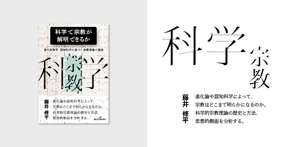
“Can Science Explain Religion?”
Author: Shuhei Fujii
Publisher: Keiso Shobo
Book Information: https://www.keisoshobo.co.jp/book/b618805.html
[Type Project Font Used]
Hama Mincho Display, TP Mincho Low Contrast, AXIS Font Basic
This book provides the foundation of the scientific study of religion; Type Project fonts are used on the cover: “Science” and “Religion,” which use large design elements, and for the name of the author and catch phrase on the book band.
Hama Mincho Display, designed for use in large sizes such as titles, is used for “Science” and “Religion” arranged in the white jigsaw puzzle part in the center.
AXIS Font Basic is used for the name of the author on the book band part, and TP Mincho Low Contrast is used for the catch phrase on the right side.
It is unusual to have three different Type Project fonts combined on the same cover. I found it very refreshing to fully understand how each typeface plays a different role depending on the purpose.
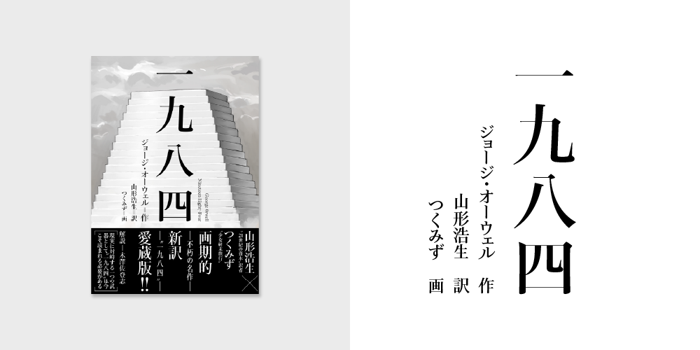
“Nineteen Eighty-Four”
Author: George Orwell
Translator: Hiroo Yamagata
Book Information: https://www.kodansha.co.jp/book/products/0000398660
[Type Project Font Used]
Jun Mincho Headline
In a newly translated treasured edition of George Orwell’s timeless masterpiece “Nineteen Eighty-Four,” Jun Mincho Headline is used in the title, for the name of the author, and on the book band part.
The cover illustration is by manga artist Tsukumizu. The title “1984” is laid out symbolically in the center against the backdrop of a large white tower-like structure looming over dark clouds, giving a sense of unease hanging in the air.
Jun Mincho Headline is a typeface with a finer horizontal stroke, tip of sweep, etc. than Jun Mincho. That delicate yet sharp impression seems to emphasize the tension permeating the entire atmosphere. Also, the fact that vertical typesetting is used, including on the book band part, gives the feel of a literary work.
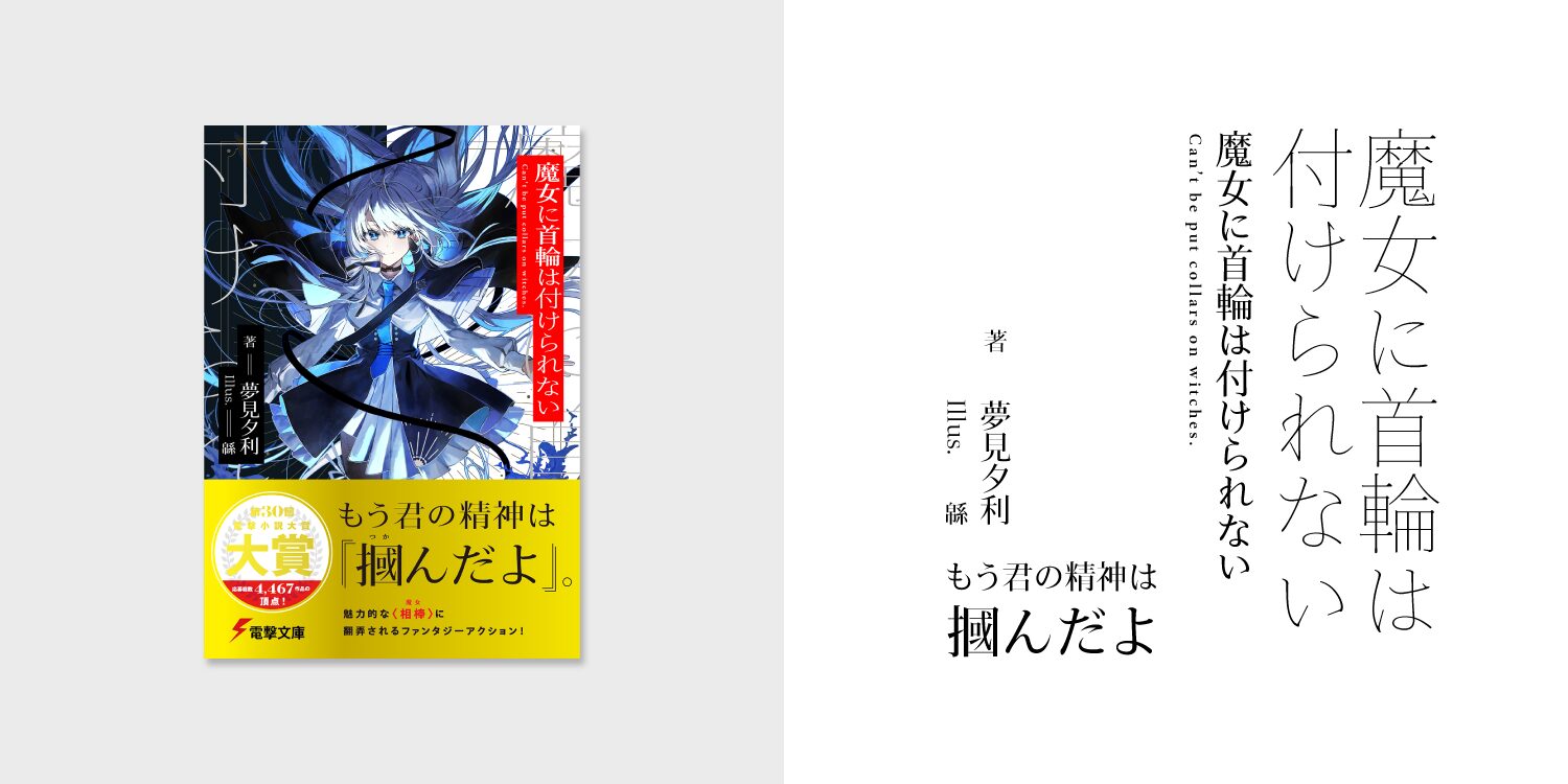
“You Cannot Put a Collar on a Witch”
Author: Yuuri Yumemi
Illustrator: Wata
Publisher: KADOKAWA Corporation (Dengeki Bunko)
Book Information: https://www.kadokawa.co.jp/product/322310000071/
[Type Project Font Used]
Jun Mincho, TP Mincho High Contrast
This light novel won the Grand Prize at the 30th Dengeki Novel Awards. It is a story blending fantasy and mystery, in which a witch and an investigator team up to tackle magical crimes. Jun Mincho and TP Mincho High Contrast are used in the title, for the name of the author, and on the book band part.
The title part features white text on a red background, while the thin weight of Jun Mincho is used along the left and right edges to blend in with the illustration. This complements the delicate illustration well.
Also, TP Mincho High Contrast is used in the names of the author and the illustrator on the left edge and the book band part. Jun Mincho, with its slightly classic impression, and Modern TP Mincho, designed with horizontal typesetting in mind, harmonize seamlessly without a strong sense of incongruity, making an impression as a fresh combination.
(KT)