%20--%3e%3cpolygon%20points='24.7%201%200%201%200%207.6%208.5%207.6%208.5%2039.4%2016.1%2039.4%2016.1%207.6%2024.7%207.6%2024.7%201'/%3e%3cpath%20d='M34.1,32.4l-4.9-22.7h-7.9l9.1,33.1c-.4,1.7-1.1,2.9-3.7,2.9h-2.6l1.9,6.6h1.5c4,0,8-1.2,10.3-9.2,1.8-6.4,8.9-33.3,8.9-33.3h-8l-4.6,22.7Z'/%3e%3cpath%20d='M91.7,8.7c-8.7,0-12.7,6.5-12.7,16.1s3.6,15.3,13.8,15.3,7.2-.9,9-1.6l-1.2-6c-2.4.8-4.9,1.2-7,1.2-4.3,0-7-2-7.2-7.3h16v-4.8c0-7.5-2.9-13-10.7-13ZM86.5,21c0-3.3,1.7-6.4,4.7-6.4s4.1,2.7,4.1,6.4h-8.8Z'/%3e%3cpath%20d='M218,8.7c-8.7,0-12.7,6.5-12.7,16.1s3.6,15.3,13.8,15.3,7.2-.9,9-1.6l-1.2-6c-2.5.8-4.9,1.2-7,1.2-4.3,0-7-2-7.2-7.3h16v-4.8c0-7.5-2.9-13-10.7-13ZM212.9,21c0-3.3,1.7-6.4,4.7-6.4s4.1,2.7,4.1,6.4h-8.8Z'/%3e%3cpath%20d='M126,1h-10.7v38.4h7.6v-11.8h5c6,0,11.3-3.8,11.3-14.1s-5.5-12.5-13.1-12.5ZM125.9,20.9h-3.1V7.6h3c3.7,0,5.4,1.8,5.4,6.3s-1.5,7.1-5.3,7.1Z'/%3e%3cpath%20d='M150,12.9c-.2-1-.5-2.4-.8-3.2h-6.9c.5,1.9.7,4.6.7,7.9v21.8h7.4v-20.3c1.1-2.2,4.5-3,7.4-3v-6.8c-3.5,0-6.5,1.7-7.7,3.6Z'/%3e%3cpath%20d='M192.6,40.6c0,3.5-1.6,4-4.7,4h-1.5l1.9,6.6h2.3c6.3,0,9.3-3.2,9.3-9.8V9.7h-7.4v30.9Z'/%3e%3crect%20x='192.2'%20width='8.4'%20height='6.4'/%3e%3cpath%20d='M247.4,33.7c-4.8,0-6.6-2.8-6.6-9.6s1.9-8.9,6.2-8.9,3.4.4,4.9,1l1-6.4c-1.3-.5-3.7-.9-6.2-.9-10.6,0-13.4,6.7-13.4,15.9h0c0,10.7,4.6,15.3,12.4,15.3s5.9-.5,7.4-1l-.9-6.1c-2,.4-3.7.6-4.7.6Z'/%3e%3cpath%20d='M264.7,30.2v-14.2h5.4l1.4-5.8h-6.9V2.1l-7.3,1.9v26.8c0,5.3,2.4,9,8.2,9s4.9-.2,4.9-.2v-5.7h-2c-3,0-3.8-1.3-3.8-3.7Z'/%3e%3cpath%20d='M64.3,8.8c-3.3,0-5.8,1.6-7.3,3.4-.2-1.1-.5-2.1-.8-2.6h-6.6c.5,1.9.6,4.4.6,7.4v34.4h7.3v-13.8c1.5,1.5,3.8,2.4,6.2,2.4,8,0,11.2-6.6,11.2-16s-3.1-15.2-10.4-15.2ZM62.1,33.8c-1.6,0-3.1-.6-4.6-1.8-.3-1.6-.4-3.7-.4-6v-3.3c0-1.8.1-3.8.4-5.1,1.4-1.4,3-2.5,5-2.5,3.2,0,4.6,3.2,4.6,9s-.9,9.6-5,9.6Z'/%3e%3cpath%20d='M173.6,8.6c-9.5,0-13,6.7-13,15.7s3.5,16.1,13,16.1,13-6.8,13-16.2-3.3-15.7-13-15.7ZM173.6,34.2c-3.6,0-5.5-2.9-5.5-9.9s2.2-9.5,5.5-9.5,5.5,2.2,5.5,9.5-1.9,9.9-5.5,9.9Z'/%3e%3c/svg%3e)

2026.3/16
Visual Adjustment and Typeface Design 02: “Line Length and Intersection”
In the previous article, I introduced visual adjustment points in regard to “line thickness.” In this article, let us look at and focus on “line length and intersection.”
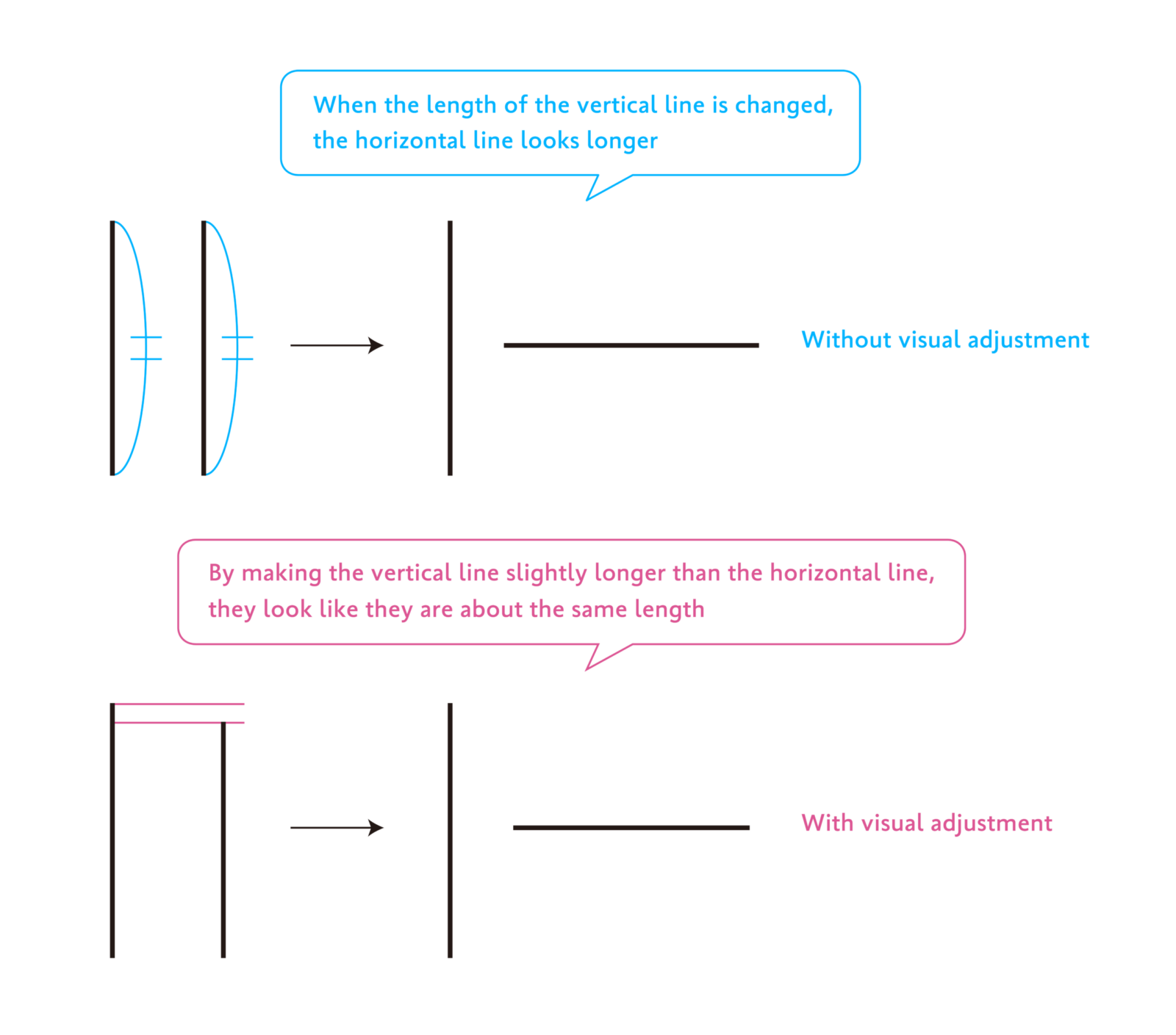
The first point when adjusting line length is to “make vertical lines longer than horizontal lines.” When vertical and horizontal lines of equal numerical length are visually arranged, the horizontal line looks longer to the human eye. Therefore, by making the vertical lines slightly longer than the horizontal lines, they will look like they are about the same length.
The second point is to “note the intersection position and length” of lines.
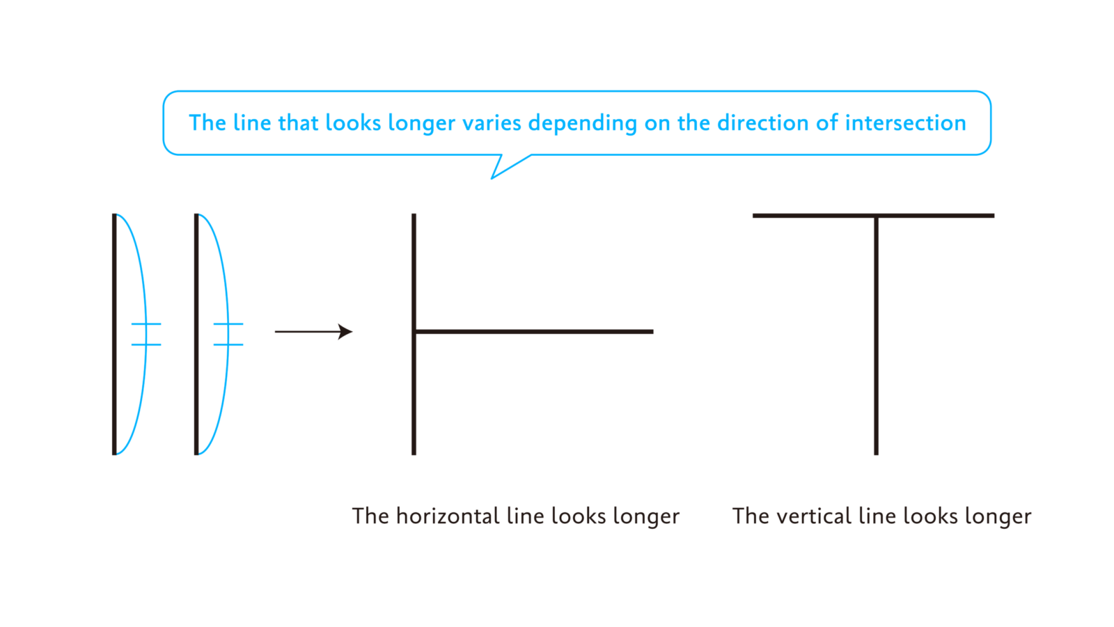
Earlier, I mentioned the optical illusion in which a horizontal line looks longer than a vertical line of the same length. When lines come into contact or intersect, the perceived length of each line varies depending on the intersection position and the manner of intersection.
For example, in the diagram on the lower left, the left end of the horizontal line is arranged perpendicularly at the middle of the vertical line. In this case, similar to the pattern shown in the beginning, the horizontal line looks longer.
However, when the same diagram is rotated 90 degrees and arranged in a T-shape, the vertical line now looks longer than the horizontal line.
Also, as shown in the diagram below, attaching V-shaped motifs resembling arrows to both ends of a line makes the length of the line in the middle look different depending on the motif’s direction.

In this way, lines of identical numerical length can appear to vary in length depending on the line placement, the shape of other adjacent diagram, etc. Therefore, a uniform rule, such as “extend a line by a certain percentage” cannot be applied. Instead, it is necessary to explore lengths that look natural on a case-by-case basis.
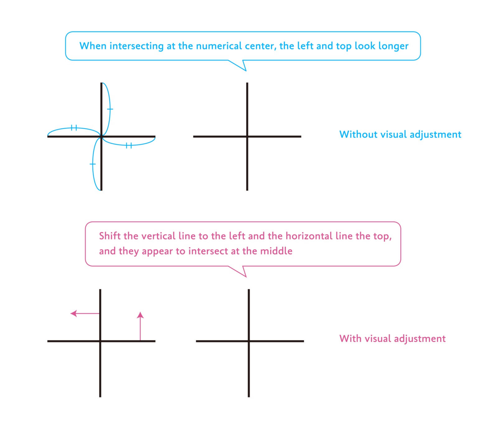
The third point is to “make the lower side longer” and “make the right side longer.” In the previous article, I mentioned an optical illusion in which the upper part looks more expanded than the lower part, and the left side looks more expanded than the right side to the human eye. This optical illusion can be applied to the same principle in regard to line length as well as line thickness.
When lines intersect perpendicularly, placing the intersection point at the numerical center of the top, bottom, left, and right makes the upper and right sides look longer, so it doesn’t look like they intersect exactly in the middle. To make it look as if the lines intersect beautifully at the center point of the top, bottom, left, and right, the intersection of the horizontal line must be slightly to the left of the center point of the left and right, and the intersection of the vertical line must be slightly above the center point of the top and bottom.
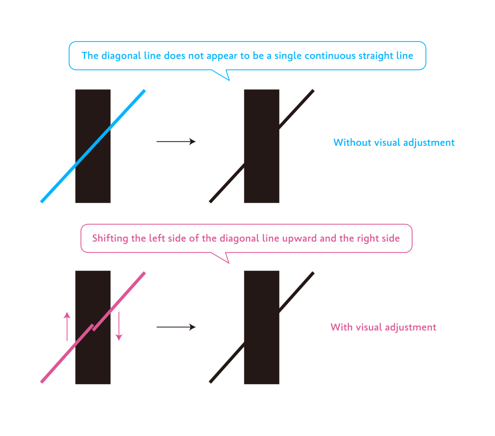
The fourth point is to “note the intersection of diagonal lines.” In the second point, I introduced precautions when lines intersect perpendicularly. However, when lines intersect diagonally, it is necessary to note different points.
When multiple lines intersect diagonally, even if straight lines overlap, one of the lines may appear to bend at the intersection point or fail to appear as a single continuous straight line. This optical illusion occurs less frequently compared to illusions with line length or perpendicular intersections. Depending on the combination of the line angle and thickness, it may look perfectly normal or look distorted.
In the example of the diagram below, a thin diagonal line is superimposed on the thick vertical line in the center. However, the diagonal line to the left of the thick vertical line looks shifted downward, while the diagonal line to the right looks shifted upward, and it is no longer visible as a single straight diagonal line.
In this case, aligning the intersection point of the left diagonal line toward the top and the intersection point of the right diagonal line toward the bottom will make the diagonal lines appear to connect beautifully.
When applying visual adjustments to actual design work, the shapes of characters are often organic, and we do not always deal with geometric shapes as shown in the diagrams above. The amount of adjustment required varies depending on the design and style of each typeface to be created, as well as the shape of each individual character. This is a very intricate and delicate process that requires trial and error while considering a variety of different aspects. However, understanding the fundamental principles is the first step toward grasping the sense of balance in characters.
(XYZ)