%20--%3e%3cpolygon%20points='24.7%201%200%201%200%207.6%208.5%207.6%208.5%2039.4%2016.1%2039.4%2016.1%207.6%2024.7%207.6%2024.7%201'/%3e%3cpath%20d='M34.1,32.4l-4.9-22.7h-7.9l9.1,33.1c-.4,1.7-1.1,2.9-3.7,2.9h-2.6l1.9,6.6h1.5c4,0,8-1.2,10.3-9.2,1.8-6.4,8.9-33.3,8.9-33.3h-8l-4.6,22.7Z'/%3e%3cpath%20d='M91.7,8.7c-8.7,0-12.7,6.5-12.7,16.1s3.6,15.3,13.8,15.3,7.2-.9,9-1.6l-1.2-6c-2.4.8-4.9,1.2-7,1.2-4.3,0-7-2-7.2-7.3h16v-4.8c0-7.5-2.9-13-10.7-13ZM86.5,21c0-3.3,1.7-6.4,4.7-6.4s4.1,2.7,4.1,6.4h-8.8Z'/%3e%3cpath%20d='M218,8.7c-8.7,0-12.7,6.5-12.7,16.1s3.6,15.3,13.8,15.3,7.2-.9,9-1.6l-1.2-6c-2.5.8-4.9,1.2-7,1.2-4.3,0-7-2-7.2-7.3h16v-4.8c0-7.5-2.9-13-10.7-13ZM212.9,21c0-3.3,1.7-6.4,4.7-6.4s4.1,2.7,4.1,6.4h-8.8Z'/%3e%3cpath%20d='M126,1h-10.7v38.4h7.6v-11.8h5c6,0,11.3-3.8,11.3-14.1s-5.5-12.5-13.1-12.5ZM125.9,20.9h-3.1V7.6h3c3.7,0,5.4,1.8,5.4,6.3s-1.5,7.1-5.3,7.1Z'/%3e%3cpath%20d='M150,12.9c-.2-1-.5-2.4-.8-3.2h-6.9c.5,1.9.7,4.6.7,7.9v21.8h7.4v-20.3c1.1-2.2,4.5-3,7.4-3v-6.8c-3.5,0-6.5,1.7-7.7,3.6Z'/%3e%3cpath%20d='M192.6,40.6c0,3.5-1.6,4-4.7,4h-1.5l1.9,6.6h2.3c6.3,0,9.3-3.2,9.3-9.8V9.7h-7.4v30.9Z'/%3e%3crect%20x='192.2'%20width='8.4'%20height='6.4'/%3e%3cpath%20d='M247.4,33.7c-4.8,0-6.6-2.8-6.6-9.6s1.9-8.9,6.2-8.9,3.4.4,4.9,1l1-6.4c-1.3-.5-3.7-.9-6.2-.9-10.6,0-13.4,6.7-13.4,15.9h0c0,10.7,4.6,15.3,12.4,15.3s5.9-.5,7.4-1l-.9-6.1c-2,.4-3.7.6-4.7.6Z'/%3e%3cpath%20d='M264.7,30.2v-14.2h5.4l1.4-5.8h-6.9V2.1l-7.3,1.9v26.8c0,5.3,2.4,9,8.2,9s4.9-.2,4.9-.2v-5.7h-2c-3,0-3.8-1.3-3.8-3.7Z'/%3e%3cpath%20d='M64.3,8.8c-3.3,0-5.8,1.6-7.3,3.4-.2-1.1-.5-2.1-.8-2.6h-6.6c.5,1.9.6,4.4.6,7.4v34.4h7.3v-13.8c1.5,1.5,3.8,2.4,6.2,2.4,8,0,11.2-6.6,11.2-16s-3.1-15.2-10.4-15.2ZM62.1,33.8c-1.6,0-3.1-.6-4.6-1.8-.3-1.6-.4-3.7-.4-6v-3.3c0-1.8.1-3.8.4-5.1,1.4-1.4,3-2.5,5-2.5,3.2,0,4.6,3.2,4.6,9s-.9,9.6-5,9.6Z'/%3e%3cpath%20d='M173.6,8.6c-9.5,0-13,6.7-13,15.7s3.5,16.1,13,16.1,13-6.8,13-16.2-3.3-15.7-13-15.7ZM173.6,34.2c-3.6,0-5.5-2.9-5.5-9.9s2.2-9.5,5.5-9.5,5.5,2.2,5.5,9.5-1.9,9.9-5.5,9.9Z'/%3e%3c/svg%3e)

2026.4/6
Visual Adjustment and Typeface Design 03: “The Size of the Space”
In the previous two articles, I introduced visual adjustments that focus on the thickness and length of the lines themselves that constitute characters, the “black parts” of characters.
In character design, the space between lines called inside space between strokes and counter, meaning the “white parts” are also an element as important as the black parts of the text and characters.
In this article, let us look at the visual adjustment points of the white parts of characters.
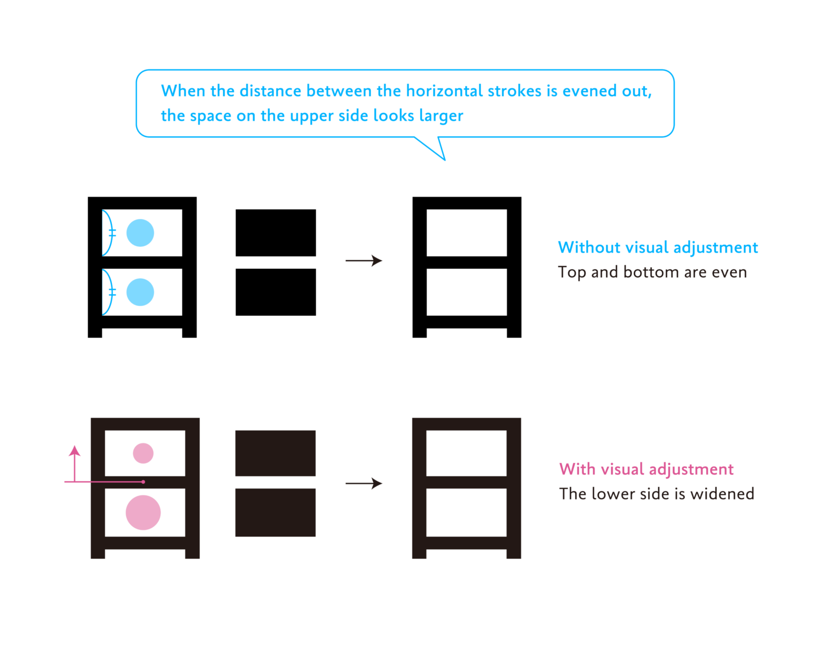
The first point is to “make the lower side wider.” In the previous article, I mentioned that the upper part looks more expanded than the lower part to the human eye. This optical illusion occurs not only with the shapes of the drawn figures but also with the size of the space. Therefore, by making the space around the lines that constitute the character wider on the lower side than on the upper side, the character shape appears more balanced.
Let us look at the example of the kanji “日” to check the inner space within the character (inside space between strokes or counter). When the horizontal line in the middle of the character “日” is numerically evened out with the horizontal strokes on the top and bottom, the white space on the lower side looks smaller than the space on the upper side. Placing the horizontal line in the middle slightly higher and increasing the space on the lower side creates a stable, well-balanced character shape when viewed.
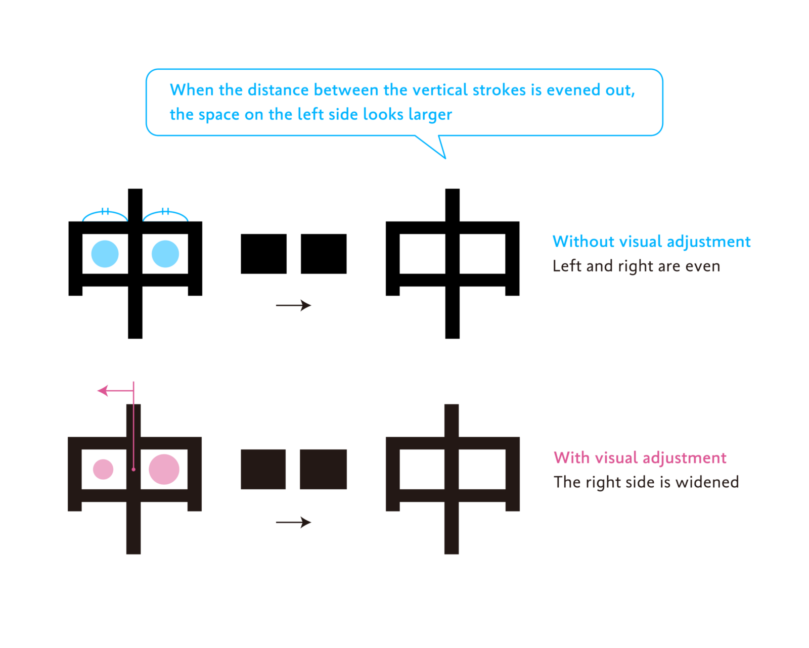
The second point is “make the right side wider.” This is a principle similar to the first visual illusion on the upper and lower sides; as the left side looks more expanded than the right side to the human eye, it is necessary to adjust to widen the space on the right side.
In the kanji “中” shown in the diagram below, the long vertical line in the middle is shifted slightly to the left of the numerical center of the left and right to create wider square space on the right side to achieve balance.
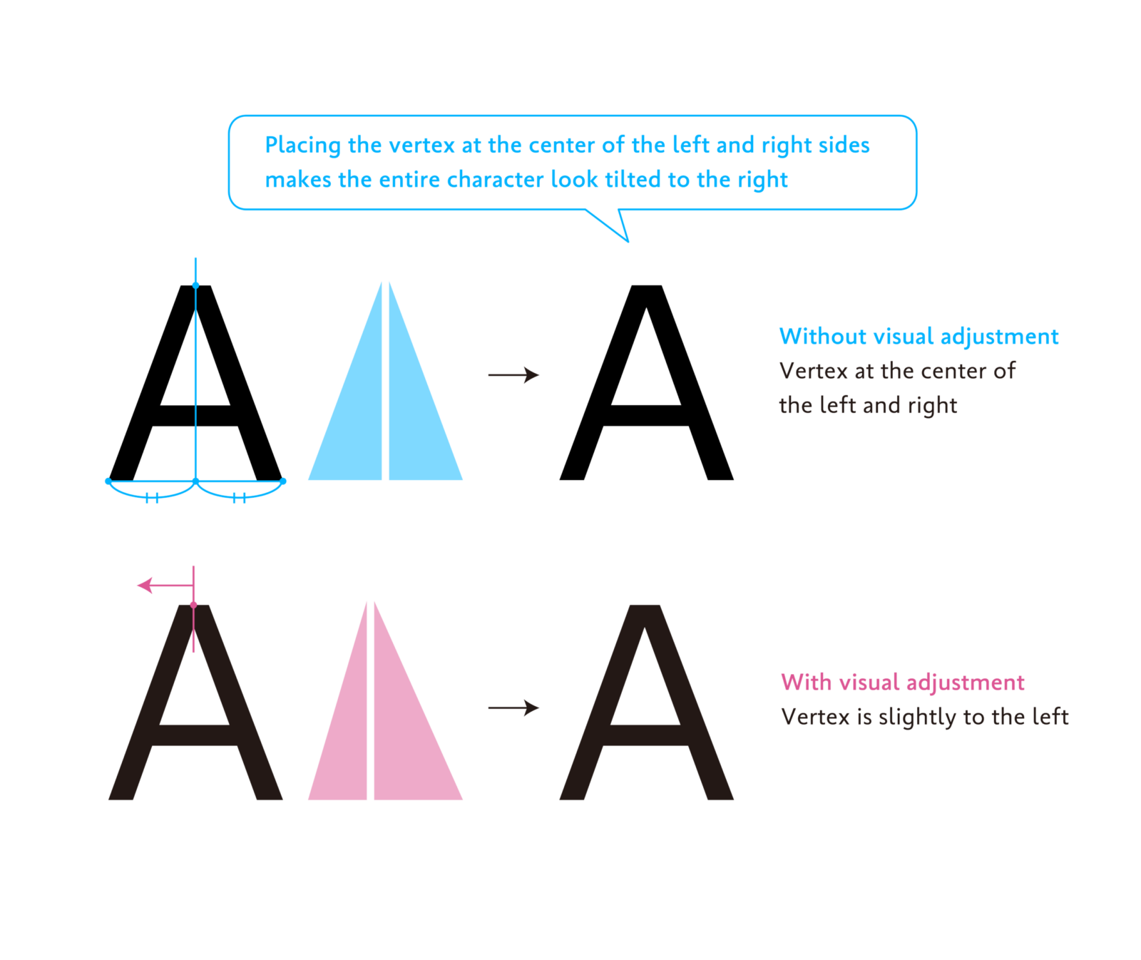
An example of a slightly more advanced adjustment is the letter “A.” The position of the top vertex of the triangle “A” is slightly shifted to the left of the center of the line connecting the two lower vertices. This is because placing the vertex in the middle makes it look tilted to the right. By shifting the vertex and making the right side of the entire character larger, encompassing both the black and white parts, it is adjusted to look symmetrical to the human eye.
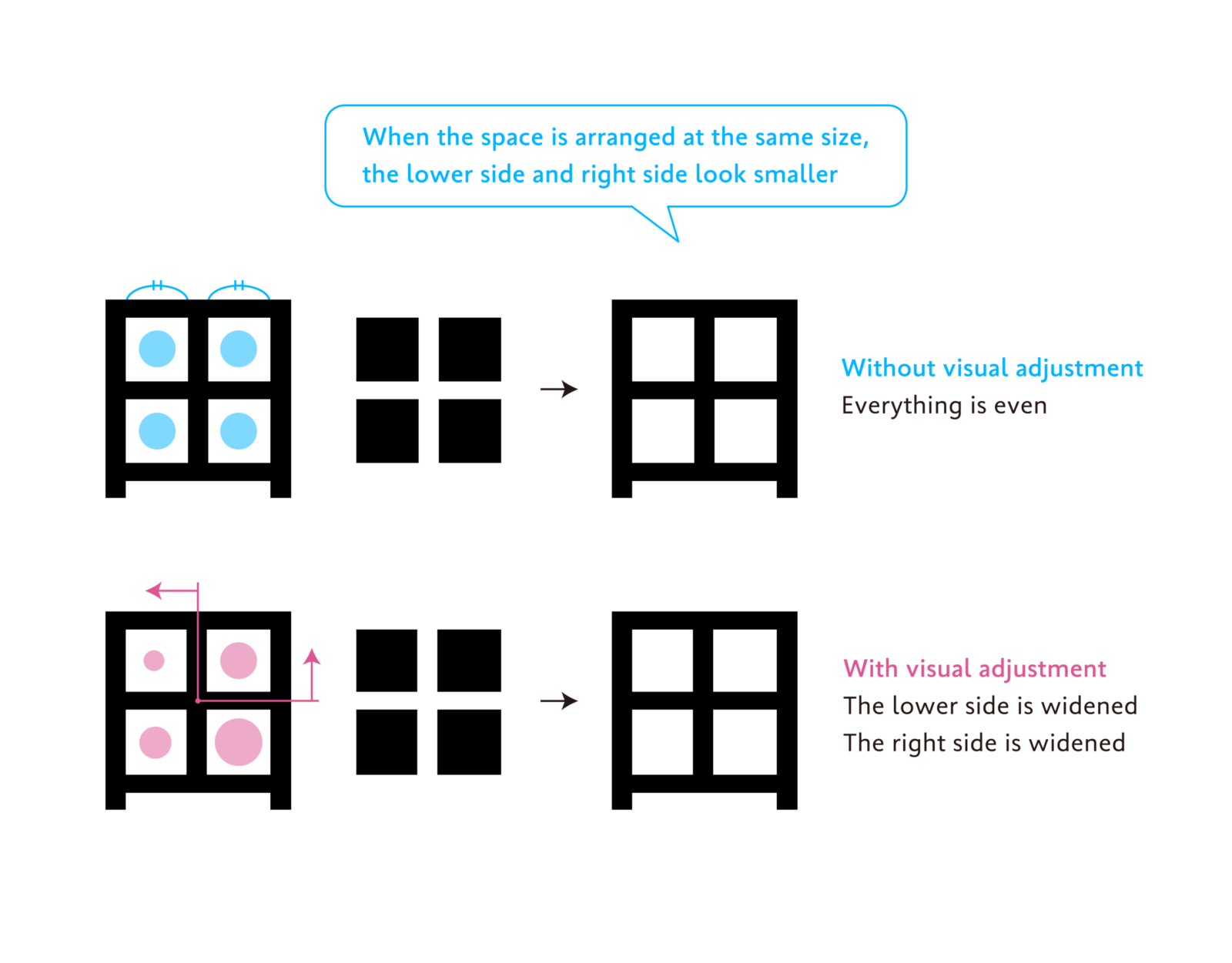
An example combining the first and second points is the kanji “田,” which was also introduced in the article “Behind the Scenes of Typeface Creation: Visual Adjustment 01: ‘Size of the Empty Space.’”
By making the space larger in the “lower side more than the upper side” and the “right side more than the left side,” the character shape appears well-balanced.
When drawing characters, it is easy to focus only on the black parts, but it is also necessary to pay attention to the margins. I remember being repeatedly advised by my mentors during my student days studying typeface design: “Characters are made of black and white. You cannot create a well-balanced shape by looking only at the black parts.” If you ever find yourself working in character design, please refer to the visual adjustments for the white parts introduced in this article.
(XYZ)